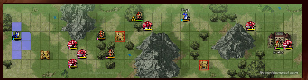
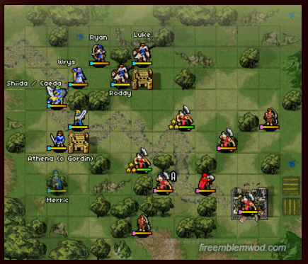
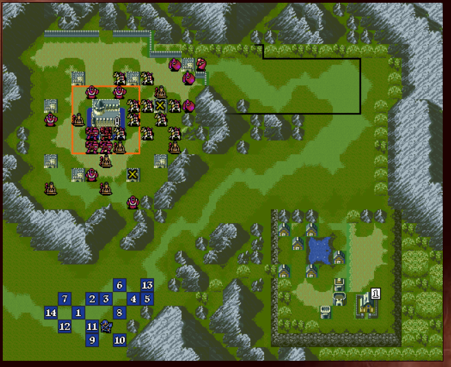
This is the only gaiden chapter in FE 12 that isn’t poorly designed. Here Wrys is threatened, which counts as a reason to get the player to play faster. The combination of Armor Knights and Archers at the start of the map works since Armor Knights will slow the player down while the Archers can attack from a distance behind them. Enemy reinforcements will show up on Turn 4, which further encourage the player to play faster. This map isn’t really short, which sets it apart from every other gaiden map since it can’t be beaten super quickly on a casual run.
Overall Rating: Pretty Good
__________________________________________
Chapter 6x
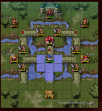
Every time I play this map I always have to 1 turn it. It’s so short that it’s practically begging to get 1 turned. I won’t hold that against the map. This map is so small that even if the player isn’t 1 turning it they’ll be beating it in under 5 turns easily. Caesar and Radd in theory help the map since the player has to beat it while not killing them, but I question whether they’re worth the effort or not. The map is too small which means that there isn’t very much room to maneuver around.
Overall Rating: Below Average
_____________________________________
Chapter 10x
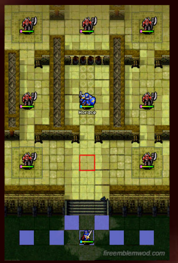
So this map’s gimmick can be adequately described as “Where’s Roro?” (Apparently he decided to take Waldo’s place after Chuck Norris found Waldo). Basically the player has to figure out which Roro is the real one. If the player kills a fake Roro they’ll come back to life during the next turn. I like this idea but it means that only one battle is actually meaningful in the long run so the player could in theory choose to not attack the other Roros during the Player Phase.
Then there’s the “Where’s Roro?” gimmick. I don’t see this as having a positive effect on the gameplay for the following reasons. Let’s say that the player doesn’t know where the real Roro is. This gimmick ends up serving a similar function to Fog of War meaning that it’s only purpose is to intentionally hide information from the player, because….reasons. If the player does figure out where to find Roro then what was the point of hiding him in the first place?
Then there’s also the map’s length again. Chapter 10x is so small that it’s pretty easy for even a filthy casual like myself to beat it under 5 turns. Heck, if the player’s lucky they can 1 turn it by having My Unit 1 RKO the real Roro. Also, what purpose does Horace serve in this chapter?
Overall Rating: Fail!
_____________________________________
Chapter 13x
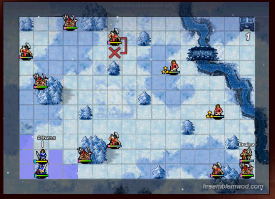
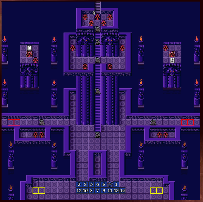
The first gaiden in Fire Emblem 12 to have Fog of War. Ugh! Fog of War is already a bad mechanic, but to eliminate torches and a thief’s ability to see further makes it even worse. In this game, each of the player’s units can only see two squares ahead. TWO SQUARES! Why? It’s also a rout map which is stupid. The rout objective does not work well with Fog of War.
Also, the unit positioning is...questionable at best. For example, why are there two ballista within reach of the player? I know that it’s Fog of War and that the player can’t see these ballista, but what’s the point of having them so close to the player? Like virtually all the gaiden maps the size is too small which means that it’s too easy to traverse the entire length of the map in no time.
Overall Rating: Fail!
_________________________________________
Chapter 16x
I wanted to like this map. I really did. It has two routes to approach it from and turtle disincentives in the form of enemy reinforcements. However, it’s short length means that reaching the main cluster of enemies is far too easy and the lack of enemies, and enemy diversity, tends to heavily favor sword users.
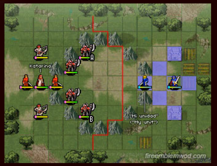
Then there’s Katarina’s recruitment. On the one hand, I like the fact that it requires more of the player than just talking to her once. Talking to her three times means that the player still has to deal with the rest of the enemies on the map including her while she tries to attack the player. In theory it should make the map harder to trivialize, but there’s just one problem: This relies on the player to actually recruit her. Personally I always recruit her, because having an extra staffbot on the team is welcome in a game where enemies are actually powerful but there are valid reasons to not use Katarina. If the player already has enough staff users on their team then her presence would feel superfluous and they might end up killing her. If that happens then the map loses a lot of its appeal and challenge.
Overall Rating: Below Average
_________________________________________
Chapter 20x
Screw this chapter! No seriously, SCREW THIS CHAPTER! Chapter 20x is either the worst, or one of the worst, designed maps of the series. For starters it has the FE 12 of Fog of War, which is a huge negative on its own. Then it made the horrific decision to add in Longbow Snipers and a boss with Meteor. Don’t get me wrong, Longbow Snipers and mages with Meteor are awesome when they’re done well. They can act as turtle disincentives and they force the player to carefully consider where they place their units. Fog of War negates this by removing the player’s ability to see where these snipers and meteor mages are and how big their attack range is.
In case this wasn’t bad enough, the map forces the player through narrow corridors that are inevitably in the path of the longbow snipers. It’s also not just 1 sniper, it’s often 2 which is even deadlier when you factor in the berserkers and armor knights on the map. This game becomes less about careful planning and more about being able to endure the ridiculousness the map tries to throw at the player.
Overall Rating: FAIL!
___________________________________________
New Mystery of the Emblem’s Final Map Design Score
Excellent: 9
Pretty Good: 4
Decent: 7
Meh: 5
Below Average: 3
Fail: 10
20 / 38 maps are Decently Designed or better, which gives Fire Emblem 12: New Mystery of the Emblem a 53 % Map Design Score.
Final Thoughts:FE 12’s score is a real shame. If the remake hadn’t made any new maps it would have the best map design in the series. FE 12 made a lengthy list of improvements on the original’s map design and the game benefited from that. 12 knew how to pressure the player at the right moments and the enemies were powerful even on Maniac Mode. Sadly, none of the care that went into the main story maps was present in most of the prologue or gaiden chapters. As a result most of them are not fun to play and they deserve all the crap that they get.
The original may have had weak sauce enemies, and its turtle disincentives could be lacking at times, but it ultimately got far more right than it got wrong. When it did have proper turtle disincentives they were on point. The enemy unit positioning could be good when it needed to be. Even though 12 has a 53 % score I’m still willing to bet that it’s going to be in the Top 5 when it comes to having the best map design of the series.
Mystery of the Emblem’s Map Design Score: 54 %
New Mystery of the Emblem’s Map Design Score: 53 %
Hmmm, a map that has only 1 playable unit, 2 enemies and uninteresting terrain. Where have I seen this before?
OH CRAP! This map is awfully similar to Lyn mode’s first map! Except, it’s smaller and all the units are stronger. Good grief game! If your first map reminds me of Lyn mode’s first map you’re doing something wrong. Really wrong.
Overall Rating for Map: Fail!
________________________________________
Prologue 2
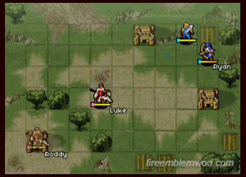
The AI in this map always frustrated me. If Luke chooses to attack Ryan there’s nothing the player can do about it. (Bytheway does anyone know how Luke’s AI works in this chapter? Just curious) This is because the map is so small that there’s nowhere that Ryan can move that would be out of Luke’s range. Another problem is that only having 2 playable units, and 2 enemies doesn’t make for an interesting map.
Overall Rating: Fail!
____________________________________________
Prologue 3
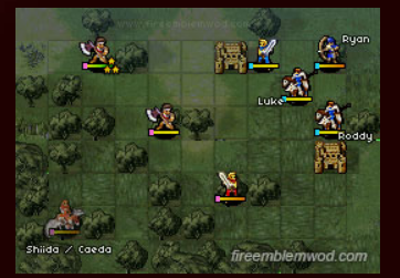
A very short and uninteresting map. To be fair it is nice that Caeda can move so that her presence forces the player to think a little bit about their positioning. However, even on Maniac Mode the enemies are so strong that the player has limited options about where they can maneuver without getting killed. That’s pretty bad on a map that’s already small enough as it is.
Overall Rating: Below Average
Prologue 4
This map is at least slightly more interesting than the previous three. There are two ways to approach the map. Either charge at the enemy and fight them off at the 2 square choke point or have everyone hide at the top left corner while My Unit’s at the front. Fighting Athena is more interesting than fighting Jeorge since Jeorge can be surrounded on all sides without having to fight back. This map is ultimately held back by a lack of a turtle disincentive.
Overall Rating: Meh
________________________________________
Prologue 5
To this map’s credit the enemy unit positioning is pretty good. Enemy attack ranges overlap each other and they cover a good portion of the map. The only problem, once again, is the lack of a turtle disincentive. At least the enemies are strong.
Edit: Thanks to my friend, Alan Coffelt, I decided to change the map design rating here to Decent since he pointed out that the map does make the player actually think about how they want to approach the barbarians which is a valid point.
Overall Rating: Decent
________________________________________
Prologue 6
This map feels like a downgrade in quality from the two maps that came before it. There isn’t much to this map outside of the bridges. I’m trying to think of more things to say but I can’t because there’s not much to talk about.
Overall Rating: Fail!
__________________________________________
Prologue 7
What’s this? A Prologue map that’s actually well designed? It’s about time. This map gives the player two routes to approach with. There’s the route on the far left and the route through the middle. Both routes are viable. This map actually has turtle disincentives! The enemy reinforcements work as incentives to get the player to play faster. In both versions of this map the boss moves and can attack the player, which is a good decision since it makes the player consider their unit positioning that much more.
Overall Rating: Excellent
_________________________________________
Prologue 8
This map does a great job at enemy unit positioning. Enemy fighters (barbarians? What class are they?) are positioned in range of the thieves so that if the player chooses to attack the thieves they have to consider dealing with the fighters during the Enemy Phase. Once the player deals with those fighters, they’ll have to deal with the archer and after they deal with the archers...you get the point. Enemy attack ranges stack wonderfully and the enemies are strong so the player has to be careful about how to approach them.
Then there’s the final bit where Katarina and her army of thieves will only start attacking once the player gets into a couple of their ranges. I like this approach with the AI since a simple bait and switch tactic isn’t good enough. It requires a more thought out method of approach. Also this map features 4 different enemy unit types, which is great since it helps to give the map some variety in the types of enemies the player has to face.
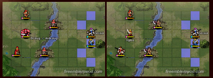
Both maps have the defined gimmick of Gra soldiers being weaker than Archanean soldiers. If the Gra soldiers aren’t killed then the player gets to recruit Sheema and Samson.
Both maps have a thief that drops the Nosferatu tome if you kill him.
Both maps have a village that gives a Seraph Robe if Marth visits it.
Which Version Designed This Map Better: The Remake
This one’s a close call since the similarities outweigh the differences. The only substantial change is that the remake provides Wyvern Knight reinforcements after the player enters certain places, like the yellow zone on the map or opening Sheema’s room. The Wyvern Knights definitely succeed at putting pressure on the player, incentivizing them to go faster. However, the original version still had a good turtle disincentive from the thief dropping the Nosferatu tome.
Overall Rating for Both Maps: Pretty Good
Maps the Original Did Better: 4
Maps the Remake Did Better: 8
Equally Designed Maps: 5
_______________________________________
Chapter 18
Common Characteristics
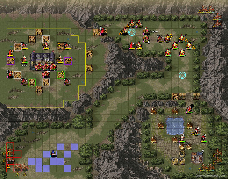
Both maps feature the Wolfguard at the top of the map ready to attack the player.
In both versions the player needs to get to the village (which has the Lifesphere) in order to call off the Wolfguard.
Both versions have a thief pop out of the cave who threatens the village.
Which Version Designed This Map Better: Neither
I’m not the biggest fan of either version of this map. The Wolfguard…exist I guess? In both the original and in Maniac Mode of 12 you can warp Marth over to the village and the Wolfguard disappear. Not sure what to say about the combination of Armor Knights and Ballista. Like the Wolfguard they’re there, but it’s really nothing to write home about.
Overall Rating for Both Maps: Meh
Maps the Original Did Better: 4
Maps the Remake Did Better: 8
Equally Designed Maps: 6
___________________________________________
Chapter 19
Common Characteristics
Both maps feature a visit where Roshea will join if visited
Both maps feature a circle of forts around the seize square where enemies will ambush the player from.
Which Version Designed This Map Better: Neither
Both versions of this map have major issues. General Horace summed up my problems with the original version of this map:
“I really don't like this map, there are no enemies outside of the "square" with the boss in it, meaning you have to slog your way through half the map doing nothing.
The remake may have solved this problem by adding more enemies, which is a big improvement, but then it jumped the gun by sending enemy reinforcements WAY too soon which ended up incentivizing turtling as opposed to discouraging it. This forces the player to play slowly as the enemies on the map will attack the player from both the front and the back. This makes the map a slog to play through in its own right. I’ve also never liked the fortresses of death in both versions. The player fights through an army of cavaliers only to get a hoard of knights pouncing on them. Gosh I hate ambush spawns!
Overall Rating for Both Maps: Fail!
Maps the Original Did Better: 4
Maps the Remake Did Better: 8
Equally Designed Maps: 7
_________________________________________
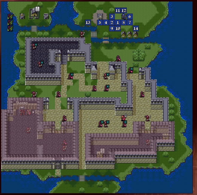
Chapter 20
Common Characteristics
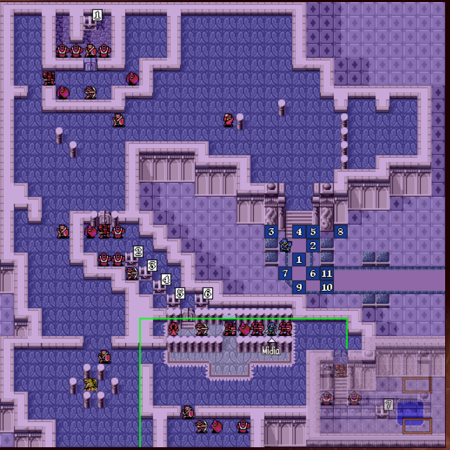
Both versions feature a little gauntlet by Hardin where enemies will try sniping at the player with enemies that have ranged weaponry.
Both versions feature Midia, who is trapped between two Armor Knights. If the player gets too close Hardin will order his men to kill her.
Both versions feature a slew of mages with ballistic siege tomes that will bombard the player upon approach.
Hardin fights with the Gradvius in both versions and can only be defeated by someone who has the Lightsphere in their inventory.
Which Version Designed This Map Better: The Original
Once again the remake jumps the gun and sends enemy reinforcements out too early. In Maniac Mode these enemies will show up by the time the player reaches the red line as shown in the map (WoD says this is only for Lunatic Mode, but they show up once the player reaches that line for Maniac Mode too). This is too early and considering how high their movement is they will catch up to the player really fast. There aren’t a whole lot of ways to deal with these reinforcements too because soon there will be an additional wave of them once the player reaches the yellow zone. I consider the early presence of these enemies to be a turtle incentive rather than a turtle disincentive.
That being said there is something the remake does better: It gives better treasures. In the original the treasure chests near Hardin are promotion items, which is stupid considering the fact that by this point in the game the players team should be consisting of high level promoted units. This translates into a ridiculous amount of money. In the remake they’re Brave Weapons and an Again Staff. Considering how powerful the enemies are in 12 those Brave weapons are life savers.
That being said I still think the remake’s version is a well enough designed map since it retained all the awesome elements from the original.
Overall Rating for the Original: Excellent
Overall Rating for the Remake: Decent
Maps the Original Did Better: 5
Maps the Remake Did Better: 8
Equally Designed Maps: 7
P.S. I found a remix of Hardin and Alvis’s theme from the FE 3 Book 2 Map Discussion Thread. You should check it out:
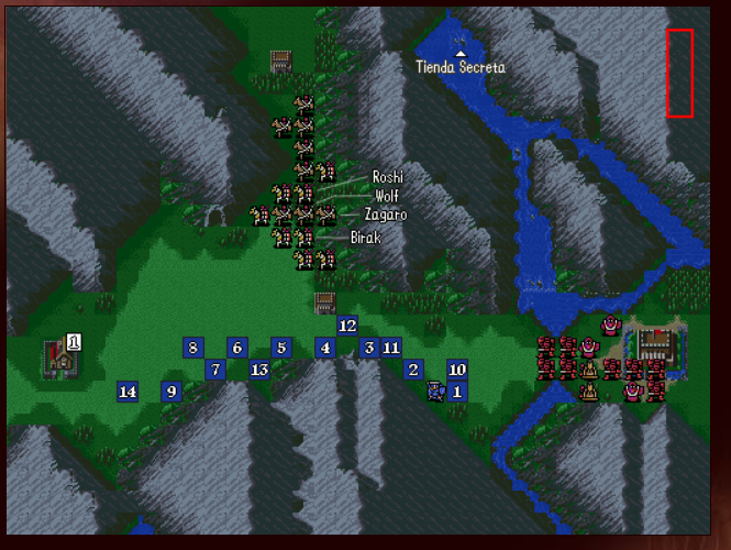
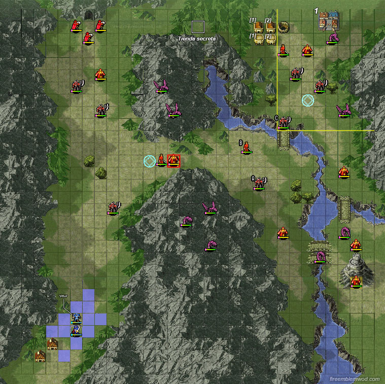
Both versions do an excellent job of positioning mages with ballistic siege tomes next to high movement wyverns. This means that the player has to pay extra attention to how they position their units.
Both versions feature a village containing the Starlight tome that’s being threatened by thieves
Both versions feature 12 movement wyverns as enemy reinforcements
Which Version Designed This Map Better: The Remake
This is another example of a close call where both versions of this map are wonderfully designed but the remake gets the edge. Remember that little bit about how thieves are threatening the village containing the Starlight tome? In the remake those thieves are there from Turn 1 and there are three of them. The original version doesn’t start out with said thieves so there’s less urgency in getting over to the village. This is also another example of a map that benefitted from having stronger enemies in 12’s version. Even in Maniac Mode it’s significantly harder to get to those thieves than it is in the original version.
The one advantage of the original is the reinforcement placement of their wyverns. As far as I’m aware, the reinforcement spawn locations can’t be blocked off. In the remake the player can sit on the fort and prevent the wyvern reinforcement from showing up. The wyvern reinforcements, however, don’t show up until Turn 12 so it’s entirely possible to beat the chapter before they even arrive.
Overall Rating for the Remake: Excellent
Overall Rating for the Original: Pretty Good
Maps the Original Did Better: 5
Maps the Remake Did Better: 9
Equally Designed Maps: 7
________________________________________
Chapter 22
Common Characteristics
Both versions of this map feature a room that can be approached two ways, that’s full of barbarians / berserkers, dragons and mages.
Both versions have treasure chests down at the bottom containing valuable stuff
Which Version Designed This Map Better: The Remake
The remake version of this map is the textbook example of why turtle disincentives are such an important part of a Fire Emblem chapter’s map design. From the first enemy phase on enemies show up behind and to the side of the player. Then the race is on! New enemies will continue to spawn until the player is either dead or the map has been beaten. There’s no in-between. The chapter continues to increase the pressure on the player with each new turn. Every enemy in front of the player acts as an obstacle in an attempt to slow the player down which further increases the pressure to play faster. Maybe I’m not doing it right, but by the time I reach the throne room I have to pull off some serious staff shenanigans or else I’m toast. This is what turtle disincentives are supposed to do! They pressure the player to play better and force the player to actually think. The original version is fine on its own merits, but it doesn’t hold a candle to the remake’s version.
Overall Rating for the Remake: Excellent
Overall Rating for the Original: Decent
Maps the Original Did Better: 5
Maps the Remake Did Better: 10
Equally Designed Maps: 7
_________________________________________
Chapter 23
Common Characteristics
Both maps feature meteor mages off to the side and in front of Gharnef. The only way to deal with these mages is to move faster, be careful with the player’s unit positioning and kill whichever mages are within reach.
Gharnef will get off his throne and attack the player in both versions once the player’s in range.
Both versions feature dragon reinforcements that show up behind the player.
Which Version Designed This Map Better: The Remake
This is another example of a map’s quality improving due to the presence of stronger enemies. The meteor mages are more accurate in this version, which makes them more threatening. The dragon reinforcements also show up earlier, which makes them more effective as turtle disincentives. To be fair I’m not a fan of how many dragons initially appear in the remake’s version and how aggressive they are. Having that many dragons charge at the player all at once becomes a turtle incentive. Fortunately this is balanced out by the dragons that show up behind the player at an earlier turn than in the original version.
Gharnef being stronger is also another boon to the remake since it’s harder to kill him than in the original where a powered up Linde can easily destroy him in a single round. This means that the player will be stuck on that passage to the throne longer which works will when combined with the dragon reinforcements from down below.
Overall Rating for the Remake: Excellent
Overall Rating for the Original: Pretty Good
Maps the Original Did Better: 5
Maps the Remake Did Better: 11
Equally Designed Maps: 7
________________________________________
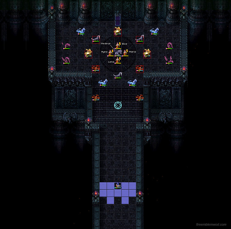
Endgame
Common Characteristics
Both versions of this map feature Nyna, Elice, Lena and Maria who have been brainwashed by Medeus. This is a brilliant design decision because no matter what the player does, they have to deal with this. Whether it’s recruiting them, killing them off, or doing a little bit of both the player has to respond to this. All of them are in Medeus’s range which makes recruitment more difficult to pull off and it forces the player to actually think.
Both maps have the “circle fort” where dragon reinforcements show up around Medeus.
Which Version Designed This Map Better: The Remake
I don’t like either version of this map. It’s basically a long corridor that revolves around fighting dragons and killing Medeus. The strategy in both versions is a little too simple for my taste. That being said, the remake’s version sucks less. The original version makes the dumb decision to have no enemies show up until the player gets close to Medeus. Why? What strategic purpose does it serve? It just makes the map easy to pull off.
The remake provides actual enemies to fight before getting to the boss. The problem is that the map becomes a slog because the map shape basically screams “TURTLE ME!” to any player who doesn’t pull off any LTC shenanigans. There’s also the difference between the power of the two Medeus’s. SNES!Medeus is a joke. Marth can double attack him and if Marth pulls off a critical hit Medeus is screwed. DS!Medeus cannot be double attacked and can only be killed only by having Marth proc 2 critical hits. That’s a lot harder to beat. In fact, DS!Medeus is one of the strongest final bosses in the series. The only real competition I can think of is Paired Up Takumi in Conquest. That’s impressive. Most impressive. In the end both maps are failures, it’s just that the remake’s version is slightly less of a failure.
The Map Design Score for New Mystery of the Emblem So Far
Excellent: 7
Pretty Good: 3
Decent: 6
Meh: 4
Below Average: 0
Fail: 4
16 / 24 maps were rated “Decent” or Higher.
New Mystery of the Emblem’s Score: 67 % (The Prologue and Gaiden chapters have yet to be rated)
As a friendly reminder: This is NOT FE 12’s Final Score. The Prologue and Gaiden chapters will be rated and taken into account for 12’s final score. The reason why I calculated FE 12’s map design score right now is to prove a point. What point is that? Well you’ll see once the prologue and gaiden chapters get rated. It’s not going to be pretty. ;)